Thursday 23 February 2012

Sir Terry Timepiece -An Initial Model (and an unfortunate discovery!)


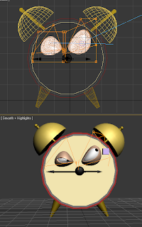
Here you see the beginnings of 'Sir' Terry Timepiece. 

I have used the eyes from my original cartoon rat character for ease and created a model that will become my final character. I wanted a relatively simple model so that rendering won't be a big issue and I stuck to the general look of an alarm clock that many people could relate to in terms of form and structure (minus the eyes of course!) 

The next part I will be focusing on will be Terry's mouth which will be integral to the facial expressions I have illustrated on my storyboard. I also want to texture him to look relatively realistic with bronze/gold coloured bells, ceramic/painted metallic body and plastic facial features.


Unfortunately or fortunately... I'm not really sure which yet, whilst continuing to research alarm clocks and how they can be animated effectively, I came across this short animation on YouTube. 

It has a lot of very similar attributes to my proposed theme and idea, without however, the main idea that I will be showing the frustration of Terry through his facial expression cementing his character as the antagonist of the piece. I think that after finding this video I will go out and film some people getting frustrated and angry, and use their facial expressions to help me turn Terry into much more of an annoyed and temperamental character rather that will move my final piece further away from this idea.

I may however still decide on changing my idea completely if I feel that I cannot move far enough away from this piece which is a little too close to my original idea for my liking.

A Couple of Tutorials

1. Cartoon Eyes


In this tutorial we learnt how to create some cartoon style boggly eyes, complete with movable blinking eyelids. Using basic spheres I modeled the eyes, with two eyelids (upper and lower) and also the head and nose of my rat creature. I then modeled two large ears by manipulating a further two spheres. Using FFD boxes I was able to warp and manipulate the head, nose and eyes into the shapes that I wanted. I used the FFD boxes on each eye and its counterparts to create a sneaky and villainous look for my character which I thought turned out quite well. I added two look at constraints, one on each eye so that the direction of the pupils could be moved independently. I made the pupils follow the shape of each eye to add to the overall shifty look of my rodent.

I particularly enjoyed this tutorial and think that eyes such as these will work really well in my chosen villain Sir Terry Timepiece, although I do quite like my rat character which I will keep incase my whole idea changes or I end up including him as a secondary character in my final animation.


2. Boning and Skinning


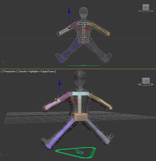
In this tutorial we learnt about boning and skinning a model so that it can be moved and manipulated for animation using bipeds and rigging. Initially I modeled a simple figure to which I could add some bones. I then used the biped to add his bones, manipulating them to fit his limbs and moving them into position. From this I then added a skin modifier to attach the model to the rig. This didn't work as planned. unfortunately the model and rig did not like the idea of becoming linked by skinning and even though the bones were added correctly to the skin modifier, both entities seemed determined to stay isolated. I continued to try this method and even completely re-modeled my figure due to his feet originally being at a strange angle to his legs (see above) even this, however did not fix the issue. I then tried using the physique modifier instead and manipulated the envelopes to encompass my whole model. This worked in a sense, in the issue regarding the model and rig becoming linked, it did not however work well. Every time I tried to move the rig, various sections of my model's arm would twist in on itself and I was at a bit of a loss as to how to fix this. 

Although this tutorial was not entirely successful, it did help me to understand the techniques used and I intend to use bones to create a rig for Sir Terry that will fit his proportions correctly which I will then use and hopefully link using the skin modifier once I have figured out what my issue was. 

Thursday 16 February 2012

Initial Storyboard


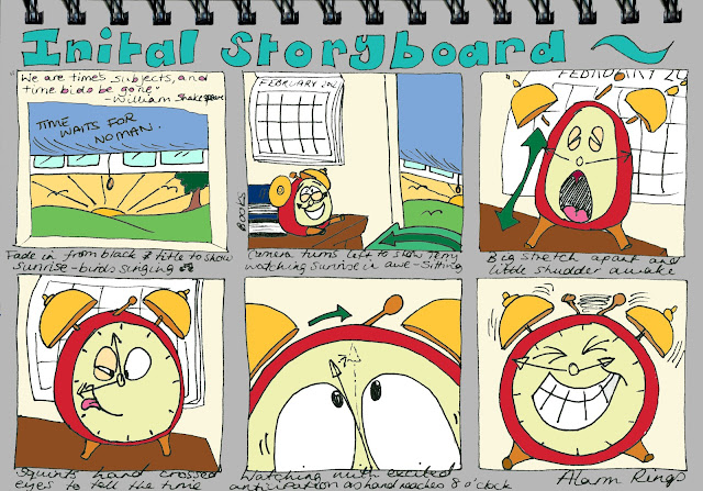
Here I have sketched out a preliminary storyboard for 'Sir' Terry Timepiece (please excuse the glaring misspelling of 'initial'). I decided on a small sketch in where Terry tries to do his duty and wake up the boy in his bed but as he does so, realises that the boy is ignoring him and starts to get more and more frustrated and angry as he tries fruitlessly so wake up the snoozing boy. Eventually this frustration and anger cause him to stray to close to the edge of the chest of drawers which inevitably leads Terry to his demise as he falls from the dizzying heights of the bedside cabinet and onto the floor below with a crash. 


To gain a better visual depiction of how this scene would look, I decided to colour this storyboard in Photoshop which can be seen below.


Character Development


During tutorial 2 we did a task that involved creating a persona for a generic character to make him more unique and to give him characteristics that make him more of a character with a back story. On the left you can see the character and the features I gave to him to make him more believable and lifelike.


As the tutorial above had shown, I needed to create a persona for my chosen character. To start with I decided on what my character would actually be.

I asked a couple of friends and family to ask their relatives between the ages of 7 and 11 who their favourite villains were and also what they dislike most. Many of the responses I got were the characters that I had already researched. The most interesting answers I received were to the "What do you dislike most?" question. To this question, the responses varied including school, getting up for school, bedtime, peas and spiders. I particularly identified with 'getting up for school' because my personal villain is my alarm clock and getting up for work! I then decided that as most of my sketches and research thus far had led me down the rather stereotypical route of how villainy has been portrayed, I thought that I would avoid this by making my character not look particularly menacing on face value but rather have an evil streak. Taking how the Beano's depicted villainous behaviour using the facial features of the character, I thought I could still create a 'villain' but avoid the trappings of his or her appearance being too obvious.


A favourite character of mine of all time has to be Pixar's Luxo Lamp, becoming integrated with the companies identity and the short animation of the big and small lamp of the same name.


I particularly like this character and animation because the character and expression of both lamps are so clear and yet the lamps do not even have faces. Using this idea I thought that I could perhaps create a villain from an everyday object, namely my alarm clock.
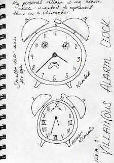


As you can see on the left, I started to brainstorm my alarm clock's persona and his characteristics.


On the right I started to generate an illustrative depiction of how my alarm clock might look. During my time spent sketching how my alarm clock might look I remembered Disney's Beauty and the Beast had a clock character called Cogsworth which I decided to research for inspiration.


Cogsworth 
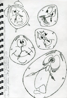


 Researching Cogsworth online led me to some sketched expressions of Cogsworth. I sketched these out myself adding an alarm clock surround on a couple to see how a face would work within my idea. The original sketch image can be found at the link below.

I found I really liked the idea of using a face as the expression would be much clearer and presumably stronger for the young audience to pick up on.


Whilst primarily focusing on expression and visual research to do with Cogsworth (as I didn't want to be influenced too heavily on using similar aspects for my alarm clock fellow) I did stumble upon a biography of Cogsworth that I thought gave an accurate description of his persona.


I decided to use categories that had been used to describe Cogsworth and relate them to my own character.


Here is the character development that I came up with for my character, now christened 'Sir' Terry Timepiece. I decided he is not officially knighted, however he likes the title and thinks that it gives him status, which he is very preoccupied with as he feels that good timekeeping and punctuality are of the utmost importance.


For clarity I have re-typed 'Sir' Terry's final biography here;

Name:  'Sir' Terry Timepiece

Personality:  Terry is pompous, self-important, has a superiority complex, rude, abrupt, annoying and suffers OCD regarding time keeping and punctuality

Appearance:  Short in stature, slightly plump, unfit (winding gives him extra energy), he has a moustache (the hands of the clock face) large goggly eyes, two alarm bells on his head and two stumpy little legs

Goal:  To make the world realise the importance of punctuality and get everyone up on time, more specifically his 'person' Timmy

Home:  Timmy's bedside cabinet

Affiliations and Allies:  Terry is a bit of a loner, no real friends to speak of although he has a soft spot for Timmy's wristwatch Tracy

Enemies:  More modern timepieces such as digital alarm clocks, mobile phone alarm clocks and he hates cockerels 

Likes:  Terry loves to watch the sunrise, he enjoys waking people and takes pleasure from startling people. He likes traditional mechanics such as clockwork, cogs and gears. He collects stamps, enjoys playing with stray bits of blue tack with his little legs and he secretly likes the pat on the head he receives after waking someone up

Dislikes:  Daylight saving time. He hates people who are early and despises people who are late. He also dislikes laziness

Powers/Abilities:  Can ring his alarm bells at will, always has the correct time

Fate:  Terry is replaced by a digital radio after smashing on the floor of Timmy's room

Quotes:  Terry likes to quote Louis the XVIII of France "Punctuality is the politeness of kings" (this is another reason he likes to refer to himself as 'Sir' Timepiece)
Tuesday 14 February 2012

Facial Expressions - Generic Villains


 Here I tried my hand at sketching some expressions that I found online, giving them life with just a few features and strokes of the pen. I feel this process has helped me immensely to gain an appreciation of the fact that there are two key areas of expression in the face that depicts the most emotion - the mouth and even more importantly the eyes!


After the market research I generated a quick and basic mind map of the main and most common features of a cartoon villain.


A quick tutorial sketch that I found on youtube later (at the address below) and I felt ready to create my own generic villainous characters;


 On the left is my generic male villain and on the right a female version. Personally speaking I prefer the male villain, whether that be impressed upon me by the multitude of male villains versus the disproportionate number of their female counterparts I am not sure, however for my project I think I am going to focus on a male villain.


Below I have created a less realistic cartoon villain using the traditional vampire idea of 'evil' (complete with pet dog... of course?)


Market Research


 For the market research I wanted to research what current villain have been developed and are obvious within popular TV programmes and magazines that are directed at the same audience as I will be designing a villainous character for.

I first searched online for popular TV shows being created for young audiences around the age of my demographic so that I had a vague idea of some of the most popular TV series and characters of the time. I then went to a large supermarket and looked at the selection of magazines available to children aged 7-11. I reasoned that a magazine would only be commissioned if the TV series was popular enough to encourage readers and subscribers so it would give me at least a starting off point for which to carry out some current market research.


 Ben 10
One of the most popular cartoon series on children's screens at the moment seems to be Ben 10. I found a magazine in the supermarket and cut and pasted images of villains and villainous characters to begin to ascertain a feel of the colour palette and running trends throughout the magazine/show so that I may compare these to other villains portrayed in competing shows/publications. The colour palette used in this publication are dark but bold colours, reds, blues, greens, purple, black and white. The adversaries to Ben 10 are generally depicted as animalistic or robotic, with menacing facial expressions/features and often are depicted as rather large in size. Reading through the magazine, each enemy had his or her own 'power' and also in balance their 'only weakness' which Ben 10 must take full advantage of.


 Doctor Who
Originally a science-fiction series created in 1963, showing until 1989 and then recommissioned in 2005. In the beginning stages of the series questions were often raised regarding the 'appropriateness' of the programme for children, as many seemed to be scared by the show, however this only seemed to fuel it's popularity - especially with the younger audiences. Now in it's return Dr Who seems to be as popular as ever with children as this magazine, clearly produced for the child fans of the show demonstrates. As with Ben 10, I cut and pasted images from the magazine and searched for common themes running between Dr Who's enemies, including their appearances, colour scheme and even their names. The appearance of each enemy of Dr Who (similar to Dr Who himself) are various in their individual look, however, some similarities are still evident. Most of Dr Who's adversaries are depicted in a humanistic way, with extenuated features, usually with some kind of damage clear on their outer shell/skin (wrinkles, rust, scales, poor skin quality). The colour palette is relatively used across the board in the depiction of each villainous character, the uses of dark and muted colours are clear to see such as browns, greens, greys, blacks, red and white. The only bright colours used seem to jump out from the 'new generation' of Daleks. As with regard to the names of these adversaries they either seem to have harsh phonetic sounds used such as 'sk' and 'ks', 's' sounds that carry connotations of snakes hissing and slithering (to which many people find fearsome) or low and deep sounding names suggesting danger or impending doom such as the Judoon.


 The Beano
A favourite comic of mine as a child, The Beano is still in publication and has been since 1938, spanning an incredible 74 years. Unlike the previous publications I have researched, the Beano demonstrates the villains from each story mainly by facial expression rather than colour scheme or menace. The colours throughout the comic are bold and striking whether the character be on the side of good or evil. I personally think that this is due to each story having characters acting in a menacing or villainous way, rather than being an out and out 'bad guy'. For example, Walter is generally not seen as the 'villain' of the Dennis the Menace sketch, but rather usually takes the position of the wimp and someone whom Dennis usually gets the better of, however, in the sketch above Walter is behaving in a rather sly and cunning way which is depicted by his facial expression rather than his overall appearance. This same facial expression can be seen time and time again throughout this edition of the comic on various character's faces, being 'real' villains or just acting in that manner for the purpose of the story.

3D Character Animation

So, where to begin...

Within this module I must undertake the task of creating a 3d character within 3DS Max to represent a villainous character. Create his persona, character attributes and appearance, whilst keeping in mind that this particular character is to be designed for children between the ages of 7-11.

As with most of my modules and projects I prefer to start with the trusty old pen and paper and so will be keeping a sketch book displaying my thought processes and work throughout the module. Now, learning from some seriously hard lessons in previous projects (and knowing my luck!) I will probably spill coffee over my sketchbook, leave it on the train, or it will just vanish into thin air! Therefore, I have decided that I should probably have an electronic and easily accessible backup of said sketchbook, which brings us to this blog and what it will entail..


First Page of the Sketchbook

So to start with I created a mindmap/brainstorm of 'Villains' and various villains that I could remember from my childhood and more recent films/stories I had seen and read.

I will be scanning in each page of my sketchbook and commenting on my thought processes and noting various features that I have not within the sketchbook itself to explain more fully my work in progress.


Here is a list of the '10 Worst Villains in Children's Books' I found this list online on the Telegraph website, the link to which can be found below;

http://www.telegraph.co.uk/culture/books/books-life/7545765/Be-afraid-the-10-worst-villains-in-childrens-books-of-all-time.html


A picture of Dick Dastardly, a rather well known and infamous villain, found in the series 'Wacky Races'. This visualises my idea of a stereotypical villain, whether that be due to the fact that I grew up with this image of villainy in my own childhood or that Dick Dastardly has many of the features of some of the most memorable villains of all time. The original image that I copied this sketch from can be found at;


As a spot of quick research I posted on Facebook as my status "Who was the most memorable villain of your childhood?", to which I received these answers. 


I wanted to research some more recent villains as up until this point I had focused on memorable villains for myself and also 'iconic' villains from the past. Here you can see a list of a few villains that have reared their gruesome faces in some recent films and stories aimed at audiences between the ages of 7-11 (and big kids too of course!)


Here, as with my sketch of Dick Dastardly I wanted to represent the female version of a memorable villain and have sketched Ursula the Sea Witch, who was to be found in the Disney motion picture 'The Little Mermaid'. I chose to sketch out Ursula as I felt she was a very different villain in both appearance and character compared to Dick Dastardly. Personally I was terrified of Ursula as a young girl, whereas I felt Dick was less menacing and took on more of a comedic role than the ruthless and vile Ursula.